My favorite art supplies: Payne’s Gray edition
Hello artistic souls!
So one of my absolute favorite colors of paint is Payne’s Gray. If you are a painter, you know that Payne’s Gray is not actually gray, but rather a dark, steely blue. I love this color because its got such poetic potential.
pAyne’s GraY
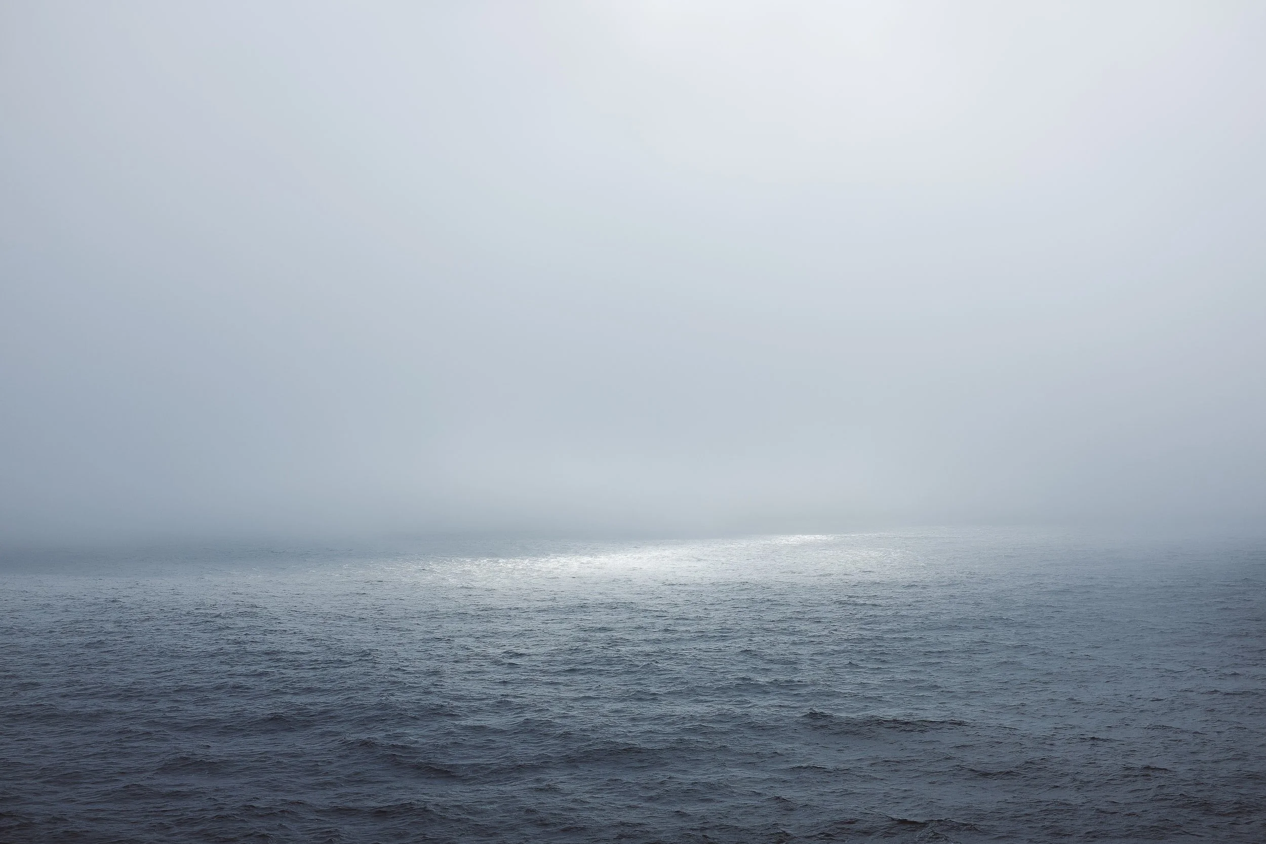
a fog you feel on your skin,
the smell of the sea,
the sky in the moment just before dawn,
a storm cloud heavy with rain.
Watercolor
Windsor Newton
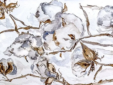
In watercolors, my favorite is the Payne’s Gray by Windsor Newton. It has a beautiful depth to it, and offers a nice range of values from a light wash to darker pigmentation, depending on how much water you are using.
In the painting above, a still life of cotton blossoms, I used the Windsor Newton Payne’s Gray in a light wash for the shadows, and added depth to the “white” cotton blossoms with darker values.
2. Acrylic Ink
Daler Rowley
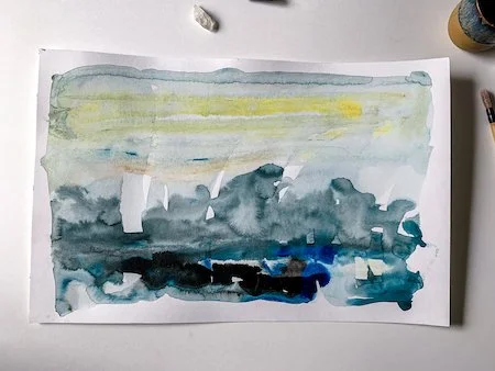
In terms of inks, my favorite Payne’s Gray is an FW artist’s ink by British maker Daler Rowley. It’s acrylic pigment-based, water-resistant ink. I like to use it from the dropper and then dilute it to achieve more subtle tones that are similar to watercolor. Even a light wash in this ink will be water-resistant when dry. which allows for successive layers of color to be added over top. In this painting, I used the ink in a lighter wash for the sky and kept it less diluted for the water. Of course this ink can also be used for calligraphy and drawing.
The ink works best on a heavier, absorbent paper. A thicker watercolor paper works, but I especially like it on this Vellum Bristol board paper by Canson. This surface really absorbs the pigment and is sturdy enough to handle even some scraping away of the pigment.
3. Acrylic Paints
Golden Acrylics
For acrylic paints, I love Golden brand. I find they are more richly pigmented, and they have a variety of mediums that can be used to adjust the texture, transparency, and weight of the paint.
The Golden fluid acrylic in Payne’s Gray is similar in consistency to acrylic ink, and thins and drips beautifully for messier abstract work and translucent layering.
The Golden artist’s acrylic in Payne’s Gray is a staple of mine. I use it in most paintings, including the seascape here in which I used the fluid acrylic in washes in the lighter areas and the regular body acrylic to create the denser, more opaque areas of the water.
4. Paint Marker
Posca Pens
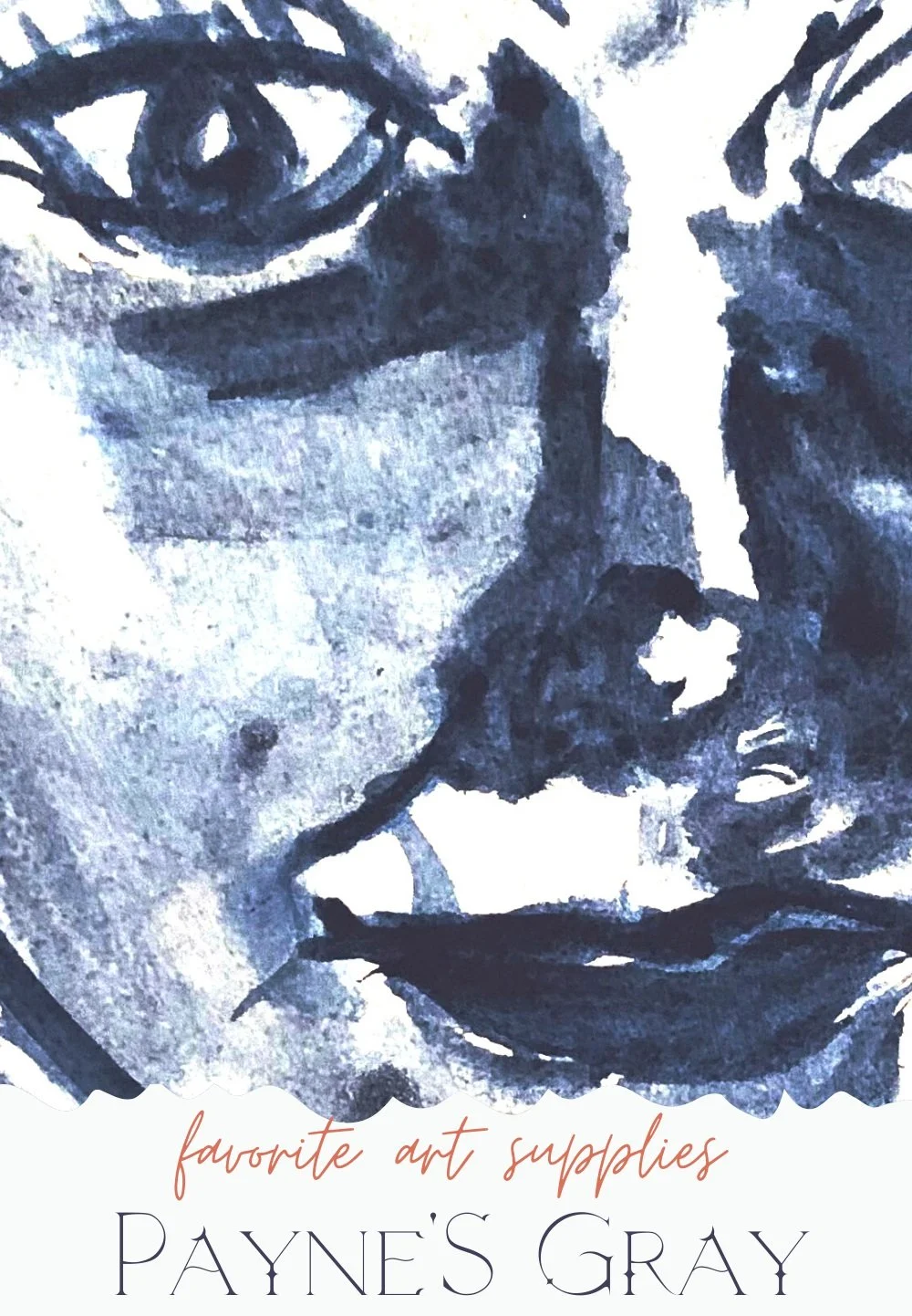
Although technically not named Payne’s Gray, I absolutely love Posca’s acrylic paint markers. The Slate Gray color does not come in the basic sets of primary colors, and so I buy these markers individually in fine point and especially in this thick-nibbed chisel point.
In this series of figure studies, I used the Posca marker to add a clean, graphic outline to the figure. (The background of this painting uses Golden acrylics, discussed above).
For other Payne’s Gray lovers, I hope this is useful info. I always find it helpful to learn which materials are used to create different textures and values.


